
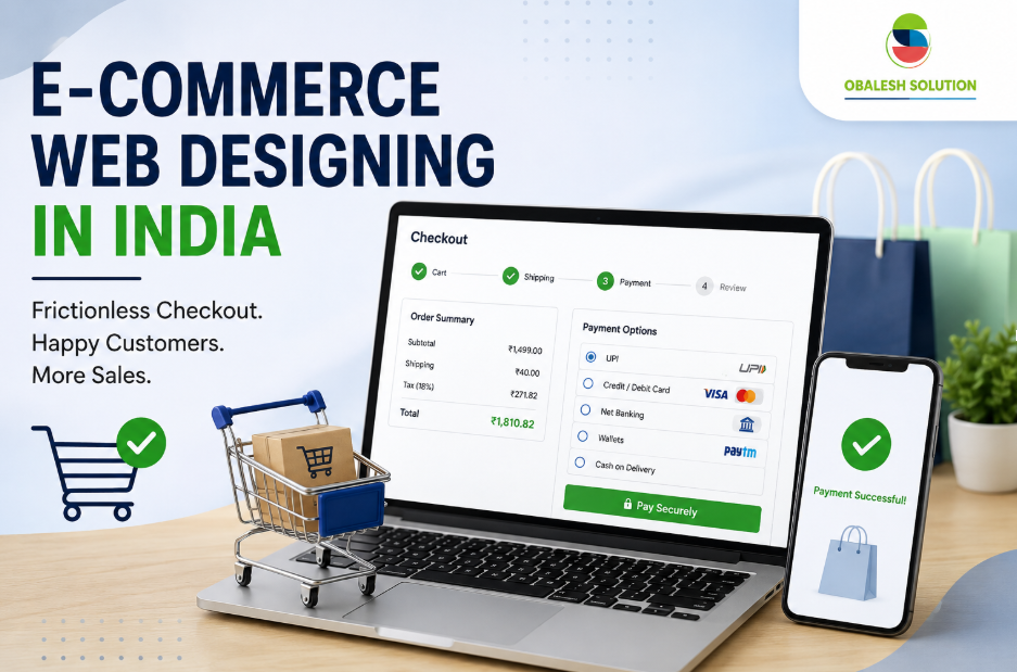
The Problem: High cart abandonment in online retail is usually caused by slow, complicated, or unexpected checkout friction rather than product pricing. The Solution: Obalesh Solution treats checkout design as a high-conversion driver tailored for Indian online shoppers using key UX strategies: Frictionless Experience: Mandatory guest checkout, upfront pricing (no hidden fees), and single-page or progressive flows. Mobile & Local Focus: Mobile-first responsive design featuring fast UPI integrations, auto-fill, and instant PIN-code detection. Trust & Real-Time Feedback: Real-time form validation and clear security badges at the payment step. Data-Driven Optimization: Tracking drop-off metrics and fixing common mistakes (like long forms or slow loading times) to maximize completed sales.
E-commerce Web Designing in India: Creating Frictionless Checkout Frameworks that Stop Cart Abandonment
Cart abandonment is the single most expensive problem in online retail. A shopper browses, adds a product, moves towards checkout – and then vanishes. For brands investing in e-commerce web design in India, this is the moment when months of marketing spend either converts into revenue or disappears into thin air. At Obalesh Solution, we treat checkout design not as a final formality but as the most important few seconds of the entire customer journey.
Why checkout friction is the silent revenue killer
Most business owners expect interruptions to occur due to price or transport costs. In truth, a large proportion of dropouts occur because the checkout itself is clumsy, slow, or difficult. This is exactly why eCommerce website design in India has evolved from a simple storefront to a discipline focused on conversion psychology, speed, and user-friendly alerts at every step.
Our team has worked with retail manufacturers across classes – style, electronics, FMCG and B2B marketplaces – and the pattern is regular: the longer or more unpredictable the payment, the higher the churn rate. Good eCommerce website development isn't about adding extra options to your checkout; it's about getting rid of every useless click, field and selection point.
The core principles we follow
- Guest Checkout First
Forcing account creation before purchase is one of the fastest ways to lose a buyer. Every project under Obalesh Solution’s E-commerce Online store design framework defaults to guest checkout, with account creation offered as an optional, post-purchase step. This single change alone has historically improved completion rates by double-digits for our clients.
- Single-page or progressive checkout
There are dominant techniques in modern e-commerce web setups in India: single website checkout for simpler catalogs and progressive (step-by-step) checkout for stores with more complicated shipping or customization wishes. We evaluate the product catalog, average order price, and customer demographics before deciding on the right version – there's no one-size-fits-all solution here.
- Transparent prices, no strange costs
Hidden shipping charges and last-minute taxes are a number of the main reasons why Indian customers abandon their shopping carts. Obalesh Solution’s approach to UX for eCommerce practices a frictionless checkout framework that shows the total cost—including delivery and taxes—early on, either at the product page or cart stage, rather than at the final step.
- Multiple, Localized Payment Options
India's payment landscape is unique: UPI, net banking, wallets, cards, and cash-on-delivery all coexist as consumer preference. Any serious e-commerce web designing strategy in India must accommodate this diversity. We integrate region-relevant payment gateways and ensure UPI—now the dominant payment method for Indian online shoppers—is presented prominently, not as an afterthought.
- Mobile-First Checkout Architecture
With the majority of Indian e-commerce traffic coming from mobile devices, checkout forms designed for a desktop-first experience fail badly on smaller screens. We build every e-commerce web designing project in India mobile-first: large tap targets, auto-fill support, minimal typing, and OTP-based verification that doesn’t interrupt the flow.
- Real-time form validation
Nothing frustrates a client more than submitting a form that is easiest to spot an error in these fields. Modern web design for e-commerce platform consists of built-in real-time validation – instantly checking PINs, phone numbers, and email codecs. We build this into every checkout template as a non-negotiable standard.
- Trust signals at the point of payment
Security badges, SSL indicators, return policy visibility, and clear customer support access all rescue last-second hesitation. This is a detail many templated store builders skip, but it’s central to how we approach e-commerce web designing—trust has to be visible exactly when the buyer is entering payment information, not just on an “About Us” page.
Measuring what actually reduces abandonment
A frictionless case is not a one-time set-up desire; it is a continuously optimized machine. Obalesh Solution treats every e-commerce engagement in India as an ongoing partnership, using funnel evaluation, heat maps, and consultation recordings to pinpoint exactly which customers are hesitating or exiting. Common data points we track include:
- Time spent per checkout step
- Field-level drop-off rates
- Payment gateway failure ratio
- Cart-to-checkout initiation ratio
- Checkout completion rates by device type
This fact-driven loop is what separates actual powerful eCommerce website design in India from regular template installations. Our procedure involves testing variations of button placement, form length, or even microcopy to squeeze out incremental – and often dramatic – improvement in conversion.
Common Mistakes Indian E-commerce Brands Make
Through years of client work, we have catalogued the recurring checkout mistakes that plague e-commerce web design in Indian projects built without strategic input:
Too many mandatory form fields (address line 2, landmark, company name, etc., when unnecessary)
- No progress indicator during multi-step checkout
- Payment gateway timeouts with no retry mechanism
- Poor error messaging that doesn’t tell users that something went wrong
- No auto-detection of PIN code to city/state
- The checkout page is slowly draining 3G/4G connections.
Fixing even two or three of these issues can notably lift completion offers. This is the kind of tactical, detail-oriented work that defines Obalesh Solution’s reputation in e-commerce web designing in India.
Why Partner With Obalesh Solution
Choosing a partner for e-commerce website design in India means choosing a team that understands both the technical architecture of e-commerce platforms and the behavioral psychology of Indian online shoppers. Obalesh Solution combines UX research, payment gateway expertise, and performance optimization into a single, cohesive checkout framework—built specifically to reduce cart abandonment rather than simply “look good."
Whether you’re launching a new D2C brand or re-platforming an existing store struggling with high abandonment rates, Obalesh Solution’s approach to e-commerce web designing is built around one measurable goal: turning more visitors into paying customers, reliably and repeatedly.